Darker skin tones are rich, luminous, and beautifully complex — and makeup should celebrate that depth, not hide it. This guide walks through everything you asked for: undertones, foundation matching without ashiness, color correction for dark circles and hyperpigmentation, concealers that brighten without chalkiness, powders that don’t flash in photos, flattering blush/contour/highlight choices, eye and lip color guidance, framing brows and liner, and how to keep makeup dimensional and camera-ready. Every section includes practical, step-by-step tips you can use right away.
Celebrating Depth, Undertones, and Rich Complexions
Start with a mindset: darker skin is not a single shade — it’s a spectrum of depths and undertones. Great makeup enhances the natural richness (warm golden glow, cool berry depth, or olive neutrality) rather than covering it up.
Quick prep tips (foundation for success)
- Hydrate and prime: Well-moisturized skin reflects light beautifully and prevents foundation from settling into texture.
- Work with depth + undertone: Always consider both — shade depth (how light/dark) and undertone (warm, cool, neutral, or red) together determine a perfect match.
- Test in natural light: Natural daylight is the truest judge.
Keep the goal simple: your skin should look like your best, evened version — not a mask.
Understanding Undertones: Warm, Cool, Neutral, and Red
Undertone influences which colors pop and which look muddy.
How to find yours (step-by-step)
- Vein test: Look at veins on the inside of your wrist in natural light. Greenish veins suggest warm; bluish/purplish suggest cool; a mix or hard-to-define means neutral.
- Jewelry test: Gold looks flattering on warm undertones; silver on cool; both on neutral.
- White fabric test: Hold pure white vs off-white next to your face — if pure white looks harsh, you may be warmer/olive; if pure white brightens you, you may lean cool.
- Sun reaction: If you tan easily with a warm golden tone you likely lean warm; if you burn or bronze to olive you may be neutral/olive.
Note: many darker complexions have warm or red undertones; olive undertones are common too. Knowing yours helps pick foundation, concealer, blush, and lip colors that harmonize rather than clash.
How to Find the Perfect Foundation Match (Without Ashiness)

Ashiness happens when undertone or depth aren’t matched, or when formulas oxidize or leave a gray cast.
Foundation match routine (step-by-step)
- Prep skin with your normal moisturizer and primer so foundation sits as it would daily.
- Swatch three shades along the jawline (not the inside wrist): one that looks like your bare skin, one slightly lighter, and one slightly darker.
- Blend each swatch down to the neck and wait 1–2 minutes — some formulas oxidize slightly. The best match disappears into your skin line.
- Check in natural light (stand by a window) and in room light. If one swatch blends seamlessly into both face and neck, that’s your shade.
- Consider undertone: if a shade makes your skin look ashy or gray, switch to a warmer undertone; if it looks orange/overly warm, try a neutral-cool option.
Application tips to avoid ashiness
- Use thin layers; press product with a damp sponge to melt it into the skin.
- For very deep tones, powders with strong white silica can cause flashback — choose powders formulated for deep skin or tinted powders.
If you’re between shades, a mix (1:1) of two foundations often solves the issue.
Avoiding the Gray Cast: Common Shade Mistakes to Watch For
Gray/ashy results come from a few repeatable mistakes — avoid them.
Mistakes & fixes
- Using the wrong undertone → switch to warm/neutral if ashy.
- Applying foundation only to the face → always blend down the jaw/neck/chest where visible.
- Over-matting with white-based powders → use tinted or long-wear powders made for deeper tones.
- Old oxidized products → discard or shake up if separation occurs.
- Too much full-coverage product layered heavily → thin, built coverage is more natural and less likely to ash.
A subtle, skin-matched base is always the best defense against ash.
Color Correcting Dark Circles and Hyperpigmentation Properly
Dark circles and PIH (post-inflammatory hyperpigmentation) are common and benefit from correctors used thoughtfully.
Color corrector guide (step-by-step)
- Identify the color: blue/purple under-eye areas need orange/peach correctors; brown/gray PIH may need a warm orange or deep peach depending on the depth; red marks respond to green corrector.
- Choose the right depth: corrector shade should be one that neutralizes — on darker skin you’ll often need deeper orange/terra-cotta tones rather than pale peach.
- Apply sparingly: dot a tiny amount on the spot with a small synthetic brush or fingertip.
- Blend only the edges so you don’t lose the neutralizing effect.
- Layer concealer of your usual depth on top — tap lightly to avoid moving the corrector.
- Set lightly with a translucent or very lightly tinted powder, pressing with a sponge.
Important: heavy use of pale peach correctors can look ashy on deep skin; choose pigmented orange/brick tones made for deeper complexions.
Choosing Concealers That Brighten Without Looking Chalky
Concealer selection depends on purpose: brightening under the eye vs spot covering PIH.
How to pick and apply (step-by-step)
- For under-eye brightening: choose a concealer that is 1–1.5 shades lighter than your foundation but still shares your undertone. For deeper skin tones, avoid overly pale “banana” shades — they can read chalky. Opt for warm-peachy illuminators when needed.
- For spot concealing: match your foundation depth exactly or use a concealer one shade darker for deeper brown spots to prevent a “hole” effect.
- Texture choice: creamy, medium-coverage formulas work best — too matte and they cake; too emollient and they crease.
- Application: apply thin dots, blend by tapping with a small sponge or brush; allow to set, then add a second thin layer if needed.
- Set carefully: press a tiny amount of powder under the eye (use a small brush or puff) — avoid heavy powder that dulls or cakes.
Key point: less product, better placement, and warm undertone matching prevent chalkiness.
Setting Powders That Don’t Leave a White Flashback
“Flashback” is often caused by high amounts of silica, titanium dioxide, zinc, or SPF in the powder, which can look ashy or ghostly in flash photography.
How to choose & use powders
- Choose tinted setting powders made for deeper tones instead of pure white translucent powders.
- Look for powders labeled safe for photography / no flashback or those formulated with finely milled pigments for darker skin.
- Press don’t sweep — use a damp sponge or puff to press powder into the skin where needed (T-zone, under-eye) rather than swiping with a brush, which can disturb base layers.
- For photos: apply powder sparingly and test with a quick phone flash in low light to ensure no flashback.
If you must use a white-leaning translucent powder, use it very sparingly and only where absolutely necessary (not on the whole face).
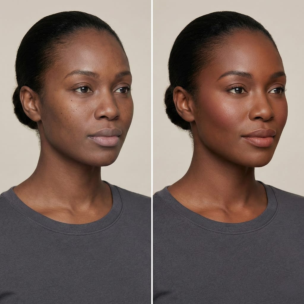
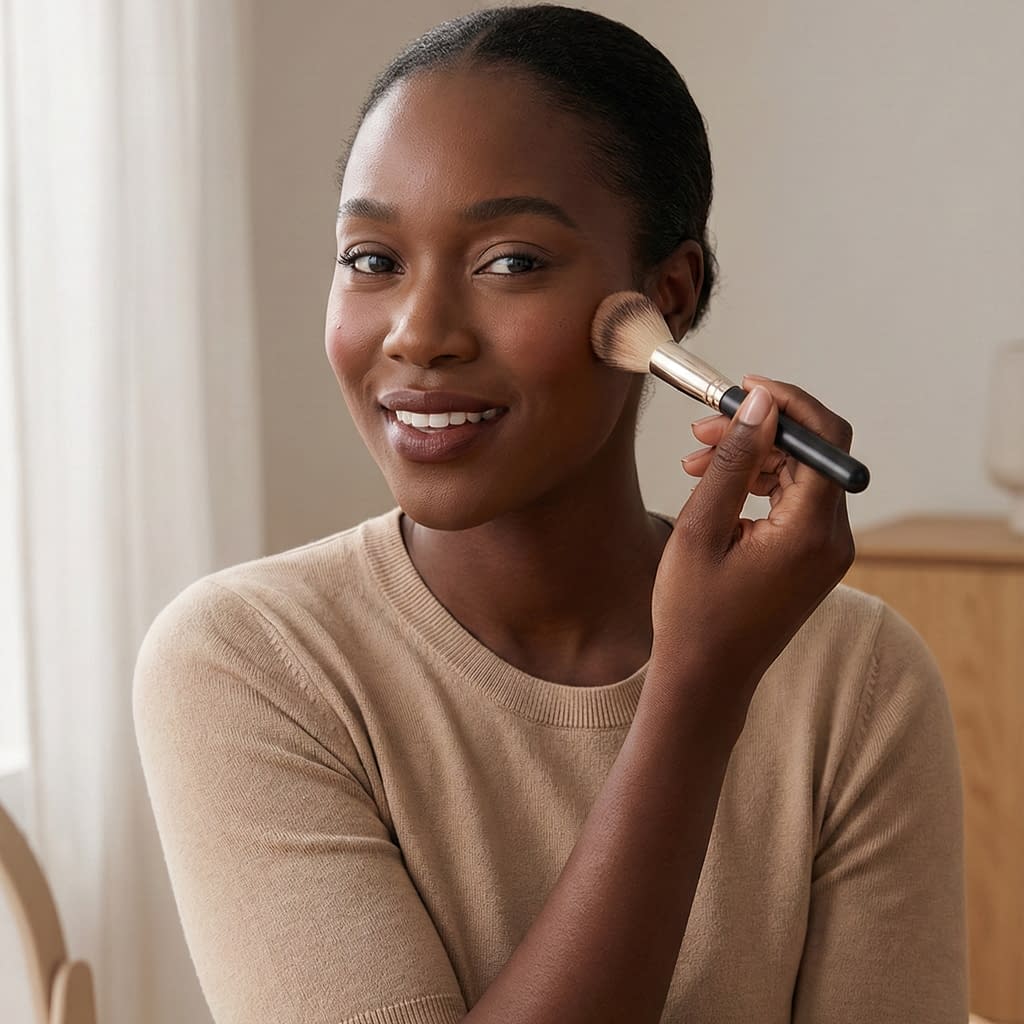
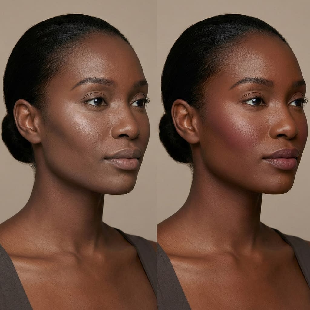
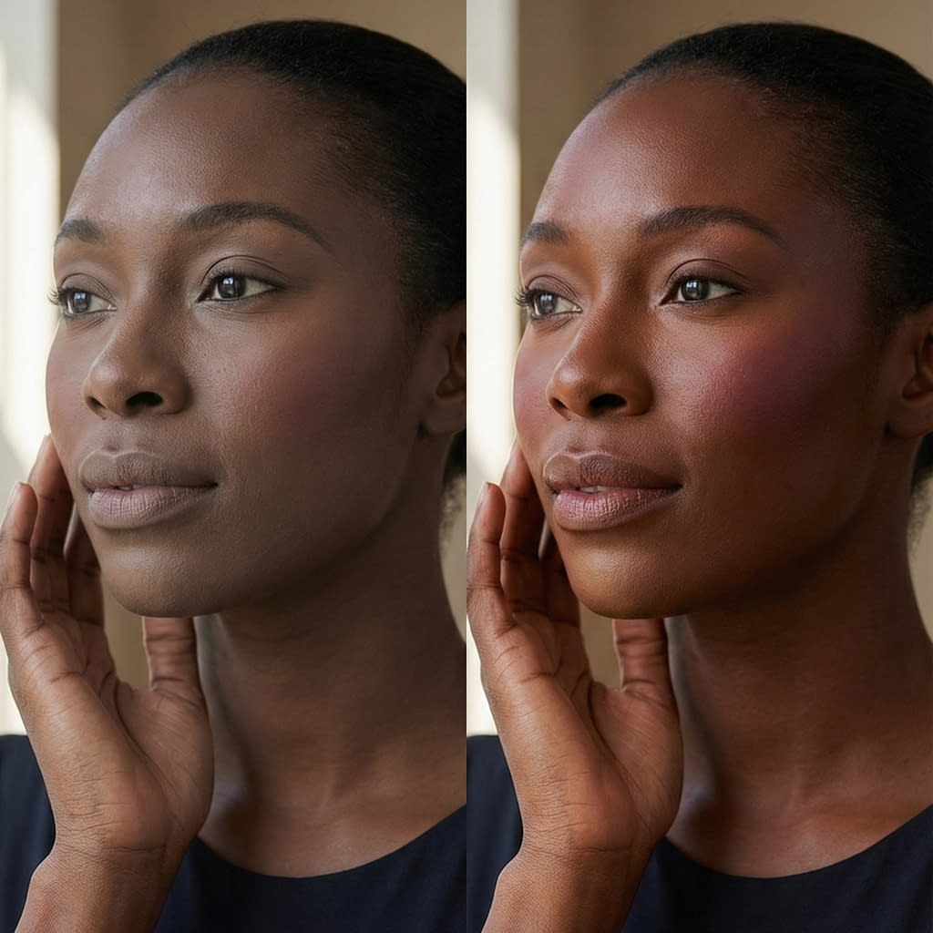
Blush Shades That Pop Beautifully on Deeper Skin
Blush is a beautiful way to add life and warmth.
Shade guide & application
- Warm berries and plums: rich wine, berry, plum — these read vividly and naturally on deeper skin.
- Deep corals and warm terracotta: for a sun-kissed look without looking orange.
- Brick reds: when applied lightly, they add gorgeous warmth.
- Peaches: choose deeper peach/amber tones rather than pastel peach.
Application steps
- Smile and apply to the apples of the cheeks, but on deeper faces, sweep slightly higher toward the temples for a lifted effect.
- Start light and build gradually — tap excess off your brush before applying.
- Blend edges outward with a clean brush or sponge for a natural flush.
- If using cream blush, set the edges with a touch of powder blush in a matching shade.
Avoid pale pinks that can look ashy; choose pigmented, warm tones.
Contour and Bronzer: Enhancing Structure Without Muddy Tones
Contour on darker skin works best with cool to neutral deep browns, not ashy grays or orange bronzers.
Contour & bronzer step-by-step
- Choose contour shades in cool to neutral deep brown tones — avoid orange or muddy browns that make skin look dirty.
- Placement: draw a small stripe under the cheekbone starting near the ear and blend downward and forward; apply a tiny amount along the jawline and at the temples to shape.
- Bronzer: pick warmer copper or golden brown bronzers for a sun-kissed glow; apply lightly where the sun naturally hits (forehead, cheekbones, bridge of the nose).
- Blend thoroughly with a fluffy brush or damp sponge — blend outward until there are no hard lines.
- Layer: if a very sculpted look is desired, build in thin layers; heavy single layers can look muddy.
Important: a slightly cooler contour shade looks natural and sculpted on deep skin when blended well.
Highlighter Shades That Glow Instead of Looking Frosty
Highlighters should read warm and luminous, not silver or white.
Highlighter selection & placement
- Choose golds, bronze, warm peachy-golds, and champagne tones — these complement melanin and look radiant.
- Placement: lightly on the high points — tops of cheekbones, brow bone (small amount), tip of nose (tiny), and cupid’s bow.
- Texture: cream or liquid highlighters give a skinlike glow; powder highlighters can be used lightly if finely milled.
- Application: use fingertips or a small tapping brush for creams/liquids, and a fan or small tapered brush for powders. Less is more — build gradually.
Avoid stark silver or icy shades that read as frost; warm metallics are your friend.
Eyeshadow Colors That Complement Rich Skin Tones
Darker skin carries color beautifully — jewel tones and warm metallics shine.
Eyeshadow ideas & techniques
- Jewel tones: emerald, royal blue, amethyst, deep teal — vivid and flattering.
- Warm coppers and bronzes: stunning on lids and perfect for everyday glam.
- Matte deep browns for transitions and to warm out the crease without ashy taupe.
- Terracotta and burnt orange: great for warm daytime looks.
- Shimmery golds and bronzes for inner lid and center lid pops.
Technique
- Start with a neutral base shade close to your skin tone.
- Use a deeper matte in the crease for depth.
- Pat metallics onto the lid with a flat brush or fingertip for maximum payoff.
- Smudge a little depth along the lower lash line with a pencil or shadow for balance.
- Finish with mascara and a sharp liner if desired.
Darker skin handles bold color — don’t be afraid to play with saturation and shimmer.
Lip Colors That Enhance Natural Depth and Vibrancy
Lips are a major statement area — choose shades that harmonize with undertone and depth.
Lip shade guide
- Deep berries and plums: timeless and flattering.
- Brick reds and oxblood: classic and rich.
- Warm browns and terracotta: modern and wearable.
- True reds with warm base (tomato/red-orange): pop beautifully against deep complexions.
- Nudes: choose deep, warm nudes or chocolate nudes — avoid pale beige nudes that can wash you out.
Application tip
- Line slightly and fill lips with liner first for longer wear and to prevent feathering. Use a creamy formula or stain depending on finish preference. Finish with a dab of gloss in the center for dimension if desired.
Don’t fear bright or dark — they often look most striking on deeper skin.
Brows and Liner: Framing the Face for Balance
Brows and liner define the face and should complement depth and density of natural hair.
Brow & liner steps
- Match brow color to your hair — choose a brow product one shade lighter or equal (not much lighter). Deep brows can use softer ash/warm browns depending on hair color.
- Technique: use short, hairlike strokes in the front and a slightly more defined tail. Brush through with a spoolie for a natural finish.
- Liner: deep brown or black liners work; choose softer pencil liners for smoky looks and waterproof gels/liquids for crisp lines.
- Soften edges with a smudge brush if you want a less harsh look.
Balance is the aim — brows should anchor the look without overpowering.
Preventing Makeup From Looking Flat — Adding Dimension Correctly
Depth and dimension stop makeup from appearing flat or muddy.
Dimension checklist (step-by-step)
- Layer textures: mix matte and satin finishes (matte contour, satin blush, luminous highlight).
- Contrast: use a slightly darker contour and a brighter blush to separate planes of the face.
- Strategic placement: lift with blush toward the temples, not only on apples; contour under cheekbones and sides of nose if needed.
- Finish with light-catching highlights to bring forward the high points.
- Set in stages: set under-eye and T-zone differently — less powder on cheeks preserves glow.
Dimensional makeup looks natural and photographically rich.
Photography Tips: Making Makeup Look True to Tone in Pictures
Photos can lie — control light and product choices for accurate color.
Photo tips
- Use balanced lighting (natural shade or soft white light) — harsh yellow or blue light can skew skin tone.
- Avoid heavy white SPF/primer that can flash in photos.
- Test with phone flash if you expect flashes: a tiny test photo tells you if your powder or SPF will flash.
- Adjust camera white balance if possible (most phones do automatic, but testing helps).
- A light dusting of color-corrected powder helps control shine without removing natural warmth.
Good lighting + correct powder choices = photos that match real life.
Common Mistakes to Avoid When Working With Deeper Complexions
Avoid these pitfalls for consistently great results.
Mistakes & fixes
- Using pale, cool concealers for under-eye → choose warmer, skin-appropriate brighteners.
- Over-mattifying the face → preserves natural glow with targeted mattifying only where needed.
- Picking gray or ashy contour shades → use cool/deep browns instead.
- Using white-heavy powders → pick tinted powders or modern no-flash formulations.
- Ignoring undertone when selecting foundation and color products → test and mix shades to match both depth and undertone.
A few mindful adjustments will elevate every look.
Final Words
Makeup for darker skin tones is about celebrating depth, choosing warm and rich pigments, and mastering blending and layering so color reads true and luminous. Focus on correct undertone identification, avoid pale/ashy or white-heavy products, use pigmented correctors and concealers made for deeper shades, and embrace jewel tones, warm bronzes, and rich berries for color. Layer thoughtfully, press powders to set, and use warm metallic highlighters to enhance natural glow. With the right product choices and gentle techniques you’ll create looks that are radiant, dimensional, and true to tone in person and on camera.


